Case Studies
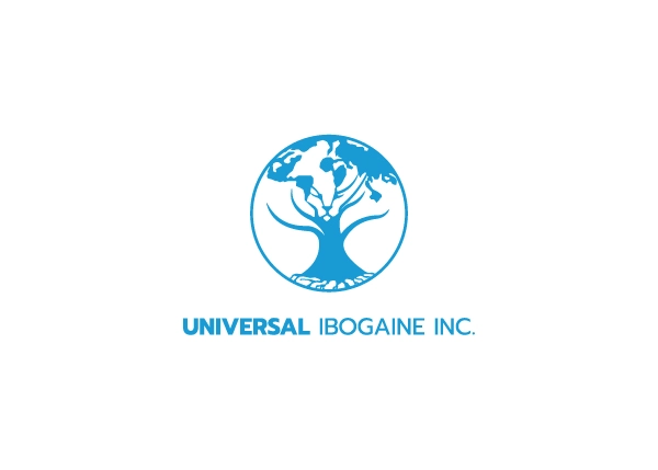
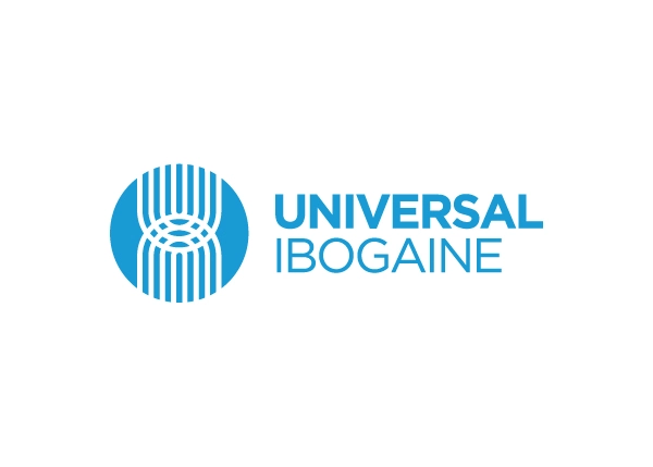
Universal Ibogaine
This company was on the brink of going public but needed a rebrand in order to:
- Simplify and strengthen their logo
- Codify their branding for other marketing contractors to utilize
- Signal their growth
The reworking of the logo took the essence of the original and elevated it, ensuring core ideas like the tree were still present.
The addition of the eye in the centre, as well as the subtle “U” and “I”, take the new logomark to the next level of branding as it relates to the company and their mission.
Testimonial
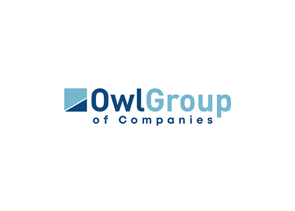
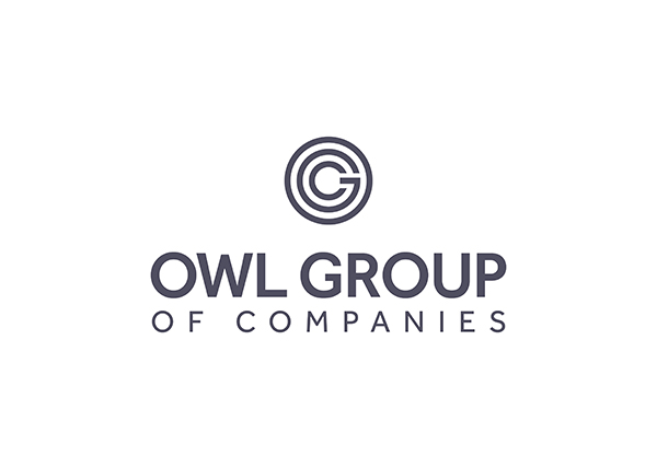
Owl Group of Companies
This company was moving into a new office space and wanted to showcase their success with a new polished, professional brand.
The new monogram logo conveys the idea of nested companies, and since Owl Group is all about protecting the legacies of the companies they buy, this fit the bill completely.
Testimonial
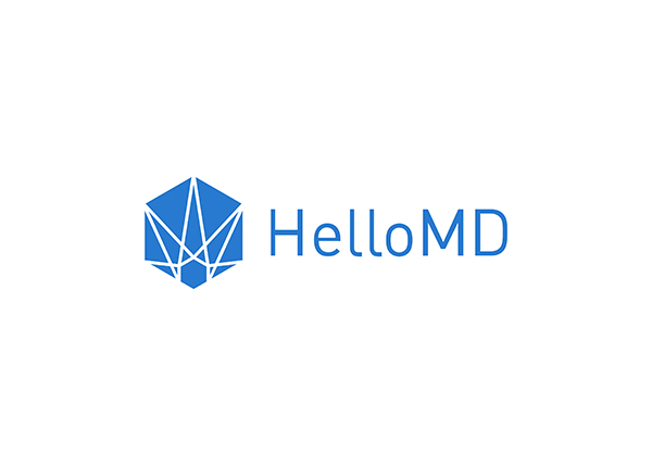
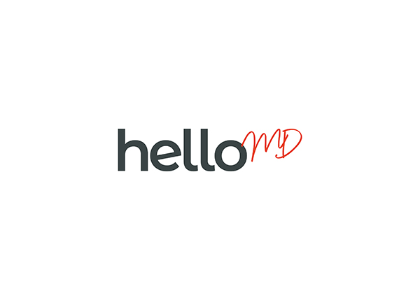
Hello MD
This company is in the medical cannabis space, with B2B and B2C operations. Their existing logo was too steeped in past strategies and positioning to be relevant to the ever-changing market anymore, and they were ready for a fresh look.
The new logo plays up the greeting in their name, and subtly downplays the medical aspect of it. It also introduces a commanding colour palette, which was a request of the client in order to mark this new chapter of the brand.
Testimonial